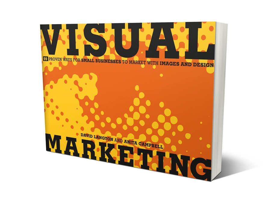
I recently spoke with Anita Campbell of SmallBizTrends.com and BizSugar.com and David Langton of Langton Cherubino Group — the co-authors of “Visual Marketing: 99 Proven Ways for Small Businesses to Market with Images and Design.” If you’d like to listen to the interview, you can find it here on BlogTalkRadio.com.
When I began my career in marketing (oh-so-many-years-ago), it was as a graphic designer. (My writing back then was limited to the occasional book review or poem.)
I’ve looked at tons of design annuals and design books over the years, and was expecting something with this book that I didn’t get — at least not in the way I expected.
When I thumbed through it the first time, I was surprised that it wasn’t in full-color. But as I went through it a second and third time, I found myself really focusing on the actual tips and how they were implemented…and in the process used an entire stack of post-it notes!
The book is divided into just three chapters: Online, Experiential and Print. And within each chapter there are 33 case studies which show off the creativity and actual success metrics of each marketing idea. At the end of each example, the authors give you a “Takeaway Tip” that’s meant to get you thinking about how you can apply the idea in your own business.
As a marketer, I’m constantly on the lookout for inspiration and campaigns that I haven’t seen before. My swipe file is pretty fat already, but this book did provide me with more than a handful of new concepts to consider. Read on for the highlights of the interview and to learn which case study was my favorite…
Q: This is a visual marketing book, why didn’t you print it in 4-color?
David: This is a business book, and one of the things that we’re really proud of is the fact that it has lots of pictures — something very unusual for a business book. We wanted to focus on the ideas and the metrics and tips behind them. We’ve given the reader lots of links so you can go online and see them in color, if you want to. But the goal was to teach the reader something about the marketing behind some of these trade secrets.
Anita: Also, when you reduce something to black and white, it allows you to focus more on details so you’re better able to glean the key points. Also, for cost reasons, the publisher determined that doing a full color book would’ve made the price way too high. Besides, it’s really meant to be an idea-generator. It’s not supposed to tell you how to design something.
Q: How did you two come up with the idea for this book?
Anita: I wish I could take credit for this, but David really came up with the idea. He was talking with the folks at Wiley publishers about using case studies to show how to inject creativity into your marketing. And do it cost-effectively. The editor he’d been talking to put the two of us together.
David: The book is meant to encapsulate so many of the things that we do as designers and marketers. To show how your marketing can excel using print, online and experiential strategies in a cost-effective way. The challenge for us was not just to make a good-looking project, but one that also had the success metrics behind them. We show a wide range of work, some that’s very affordable, and some that’s a little more aspirational. All of it is meant to get you thinking about your marketing differently.
Q: I did notice there was a wide range of projects in terms of what they might cost. For example, how Michelle Villalobos was able to inject some of her personality into her headshot. That’s a really easy thing that anyone can do. What are some of your favorite ideas for the teeny tiny businesses? That they could afford and implement?
David: To the Point Acupuncture is a great one. They use a system of stamps to customize the paper before they print their brochure. Designers came up with a nice configuration of stamps that so that a non-designer (who’s running the business) can put together a coordinated system. It’s for print on demand. It’s a nice combination of old-school rubber stamp work and new computerized work. It’s not expensive. You can stamp and change the text as you need to on the computer.
Anita: I have so many favorites. I really adored Traverse Traveler and the GoldRun mobile apps. But some of the really low-cost examples were really wonderful. For example,Vertical Response’s use of stock images for an online tip sheet. It’s so within the reach of any small business. Their tips document is really livened up with the images.
Q: In terms of writing the book, can you talk about the process? How did you work long distance with Anita being in Cleveland and David in New York?
Anita: Help, organization, some tech tools. At first it was a little more challenging and we were doing things mostly by email, but then we got into a regular groove of doing a Tuesday conference call. Once we got into that mode, we made a lot more progress.
David: I’m really into rhythm and routine. Having a deadline for every Tuesday at 2:00 meant that we could work all week and talk about what we needed to discuss on Tuesdays. In the meantime, we were reaching out to staff on either side. My business partner, Norman Cherubino did a lot of the research and finding of the case studies, and then I would try them out. On Tuesdays, we would discuss the ideas and see if they were a good fit for the book.
Q: What tools did you use for collaborating and what would you recommend for others?
Anita: We used Wufoo.com to gather community submissions. We opened it up to the small business community and accepted recommendations and submissions from design firms and so on. So rather than having all of that emailed to both of us, Wufoo collected the information and created a nice online dashboard that allowed us to keep everything organized. People could even upload their design files there. We also used Google Docs and Skype a lot, as well. [Note: I love Wufoo, too!]
Q: One of my favorite case studies, was The Joy of Marketing. I would love to hear your thoughts on their small business and how they bring such a unique flavor to what they do.
Anita: What I loved about them was that they’ve got a very personalized brand. Their logo is colorful and joyful and the visual presentation reinforces the brand name. The two principals were very friendly and delightful to work with. They help a lot of photographers market their small businesses. What we featured in the book barely scratches the surface of the creative things they can do. We met once in Cleveland and they shared a lot of the different things they’ve done. We could’ve done a whole book just on them.
Q: David, as a designer and marketer, do you have any advice for small business folks on how to kick their creativity up a notch?
David: I would say, “Hire a designer.” We’re not all talented in the same ways. If creativity isn’t your strong suit, align yourself with someone who is creative. Likewise, it’s very good to work with someone who can bring something different to a project. That’s one of the great things about working with Anita. As a designer, I can sometimes get caught up in loving the visuals. But Anita helped me remember that there’s a reason behind those visuals and that we needed to pay attention to the metrics, too.
Q: How would you recommend a small biz owner work with your book?
Anita: Thumb through it. See what catches your eye. Pick out a couple of ideas. Visit some of the companies’ websites and check them out on a deeper level. Oftentimes what we’ve shown you is just a tiny slice of a campaign or their identity. Ask yourself, “Is there something here I can apply to my own business?” It wouldn’t work exactly the same way, but if you changed this part or that part, could it work for you? Kick some ideas around with your team. Any marketers or designers that you work with, go to them and ask them to help you transform a rough idea into something more polished.
David: I love the idea that you put post-it notes all over your copy of the book. I found that in writing the case studies, I got so inspired by some of these small business owners. How did they get into some of these things? And even some that they didn’t mean to? This book is full of stories like that.
Q: Stories, yes! One of the things I love about doing [The Word Cafe podcast] is hearing all the cool backstories of small businesses. Was there something that stood out for either of you?
David: One that really surprised me was the DAAKE pillow story. The design firm came up with a pillow designed with emoticons. They sent the pillow out to a lot of prospects. But what they did that was different was they planned really unique follow-up. They sent the pillow out with a wonderful little brochure and announcement of their services. And then they created a video showing all these crazy things you could do with the pillow. It was hilarious. They had people throwing it in a dumpster or donating it to Goodwill. And it was set to a Tom Jones’ song. But it was only sent to the people who didn’t respond.
Q: Did you ask them why a pillow?
David: Yes, they were looking for something to signify comfort. The idea was that they provide comfort to their clients. It was also different. You don’t usually get a pillow from a design firm.
Q: Was there a story that stood out for you, Anita?
Anita: Yes, Two Leaves and a Bud. They sell tea. And they were trying to differentiate themselves so they could command a premium price. They’re also a fair trade company and value freshness, so they went right to the tea-growing fields in Asia and took photos of the actual farmers who actually grow the tea. They put the photos on their website and they tell the whole story. Great photos were key.
Tea: That stood out for me, too, as a way to make your product more real. Products don’t show up magically on the grocery store shelf. We need to get the customers involved with the product from the beginning. There are actual farmers involved in growing the tea. It was a great idea.
For more, see visualmarketingbook.com. A complete list of links to the case studies is here.


Trackbacks/Pingbacks